")
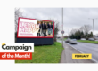
iMove Property is back with another great billboard campaign! Having used billboards before, they are back in Crystal Palace with a new board which will demand your attention! Their previous billboard, mainly themed pink, is just as fun and colourful as ever. Most of all this is a design that is both clear but also eye catching and FUN – something that is definitely an underestimated plus to any advertisement.
About the company
iMove Property, is a company who’s expertise revolves around the selling and lettings of property in Crystal Palace, ensuring that you get the best local knowledge you can possibly have to get the results you want. iMove Property aims to stand out from the rest, by giving their customers only the best tools to understand the property that they are buying but also on the other hand, give you the best chances of selling the property you are offering. These tools include the highest quality photography to ensure you can make the most educated of choices as well as personalized virtual tours of your listing and much more to ensure your listing gets the most clicks!
We felt that iMove Property deserved this title as we loved the colours that they used, instantly eye-catching and very understandable. It is important that a viewer can look at and understand the message (even if it is only basic) within about 5 seconds of viewing the billboard. Adding a lot of text can often have the problem of potential customers having to stand and read when all a billboard needs to do, is GRAB their attention, get them on to your website where you can easily have them hooked for further information. iMove does this perfectly, showing the CHAOS of the property market, only for it to come down to a simplified solution: to contact them and with the addition of a QR code for ease of access.
The timing of the campaign is ideal as summer months are a busy time for estate agents. As we recently discussed in our previous blog about the benefits of Advertising during Summer, it is a great time to be outside and enjoying the heat: not only does this mean that you get the best conditions for your billboard (don’t worry, even if it rains, our billboards can take it) but also means that your billboard gets the most eyes! More eyes means more visits on your website and if you get more visits to your website then, more clients.
Simply said: there are more people outside during the summer, making iMove’s billboard a great design as the colours and general theme stand out from the rest.
The Winning Elements of any successful advert:
- Eye-catching imagery: What would make you look at the poster if not the random text and colours? iMove employed excellent word play to great effect with their name and imagery.
- Message: Wording that you can’t take your eyes off and is consistent with the campaign’s theme.
- Adding a clear ‘Call to Action’: After becoming attracted to the poster, you are told how to contact this company.
- Humour: Making people smile is the best way to leave a lasting impression. Humour also creates an opportunity to go viral!
Visit our Instagram feed to see the amazing campaigns that have gone live across the country.
Email sales@billboardmedia.co.uk or call 020 7112 8624 to develop your own or book a meeting with our Marketing and Design Studio.