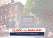
Did someone say pizza? Domino’s UK wins Campaign of the Month
A great billboard abides by the 3-second rule: can you understand and gain information from the campaign in three seconds? We’re confident Domino’s billboard does just that. Whilst we’re not here to settle the “Does pineapple belong on pizza?” debate (our office is divided), we are here to crown Domino’s UK’s billboard campaign and discuss why it tickles our tastebuds.
1) A clear call to action
The first thing that grabbed our attention was ‘50% off pizza’. It’s prominently displayed in large, bold letters in the centre of the billboard in bright white, capitalised text. Plus, the large 50 dominates the message so passersby are instantly drawn to the digits. Since the message of the offer is easily legible, it rings the audience’s alarm bells for a great food deal and triggers engagement with the brand.
The message ‘Order via the app’ in the red banner directs the audience to a straightforward next step without overwhelming them with lots of information. This is ideal for quick engagement. The message taps into the common online ordering behaviour, which increases convenience for customers. The instruction of ordering via the app is a perfect example of how out-of-home and online advertising work together, bridging the gap between the offline and online worlds and increasing campaign visibility.
The banner at the top left specifies the location where people can order their pizza from the app. By including ‘Redhill & Reigate’, the out-of-home ad caters to local passersby which in turn makes the ad feel personalised and relevant to the specific area. This can boost the likelihood of engagement.
2) Consistent branding
When creating a billboard ad, it can be tempting to use an array of colours and fonts to maximise visibility and impact. However, that is not always the answer.
Domino’s gets the answer right by remaining consistent with its red, blue and white colour scheme. By being consistent and not venturing out into other colour possibilities, passersby can instantly recognise the billboard as belonging to Domino’s and can trust it.
Another subtle yet clever way that the campaign conveys trust and brand recognition is by repeating the logo throughout the design, before ‘Domino’s’ in the centre, on the pizza boxes and on the dip lid.
3) Vivid images
The pizza images are of extremely high quality, making the pizzas visually appealing. Imagine drivers or pedestrians passing by the billboard at lunchtime or during the after-work rush hour when people usually make dinner plans: their mouths water, nudging them towards making a purchase.
Also, the high contrast between the text, images and the background enhances visibility in various lighting conditions, making the billboard effective in both day and night.
The overall layout is simple with minimal distractions which makes the campaign message more memorable, as passersby can instantly focus on the 50% off pizza offer rather than having to sift through unnecessary details.
To sum up
Domino’s campaign is a feast for the eyes and for their brand. With its clear, uncluttered design and bold, evident call to action, the campaign message does exactly what it says on the tin (or in this case, on the pizza box) inciting people to give into their promotion, buying a pizza and saving money.
Buon appetito!
Are you ready to start your advertising campaign?
Don’t hesitate to schedule a call with us or email sales@billboardmedia.co.uk if you think you have what it takes…
Ps. Don’t forget to stay up to date with Billboard Media via our social media channels and subscribe to our newsletter if you want to be updated with information about available billboards in your area.