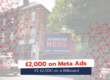
Billboard advertising is a great investment, however it must be done right to achieve the desired response. If you are new to outdoor advertising, a bit lost on how you’d like your poster to look or struggling to brief your agency, spend some time thinking about the aims of your campaign before you begin your design.
The artwork design will play a huge role in being able to effectively measure the ROI of your billboard camapign. Without a well thought-out, simple, strategic design your campaign can get little to no reaction from its audience.
If you are thinking about your first billboard campaign or looking to take on another, the AIDA model helps to guide you on the important information needed on your poster and where to place it. AIDA is a marketing model that identifies the stages an individual goes through during the buying process that aids in making the final purchase.
Rob C, from our expert billboard design company, breaks it down further and applies it to billboard designs:
A (Attention) – The first thing we need to do is grab the attention of the potential client, this is done by having a large, bold tagline situated at the very top of the artwork.
I (Interest) – Once we have grabbed attention we need to generate interest, this is done using the visual icons and descriptives to garner interest in the service being offered.
D (Desire) – Again like with the interest we’ve also used the visual icons to generate desire in the service, this will lead a potential client to the next stage.
A (Action) – We then push them to take action, this here is done by having clear, bold contact details (the ones we want them to use, no others to allow them to escape our conversion strategy).

“This strategy is best utilised and performs the best when a company’s branding and/or logo is situated at the bottom. This is because, in terms of grabbing attention, generating interest, building desire and leading a potential client to take action the logo is the least important thing on the artwork! I appreciate this sounds extremely bizarre as a lot of clients believe the brand is the most important thing, and in some instances this is true. However when using this principle to generate conversions it is not the case and only hinders the performance when situated in a different location within the artwork.”
If you have a look at a lot of advertisements by the ‘Big Corporate’ companies such as Nike, McDonald’s etc you will see more often than not they follow these principles. Rob C
Colours influence buyer decision & emotion
The right colours incorporated into your billboard poster can make a big difference on how your campaign is perceived. According to Marketing Week ‘Colour conveys emotion faster than words.’ Although colour perception can be interpreted differently based on upbringing, experiences and cultural diffferences, there has been a lot of research on how different colours evoke emotion.
Take a look at a few past/current campaigns who’s colours are aligned with their aims.
Yellow: Optimistic and youthful

Red: Increases urgency, excitement and heart rate. Normally used for sales.

Blue: Trust and secruity.

Green: Associates with relaxation, health,wealth, easiest colour for eyes to process.

Black: Powerful and sleek, used for luxury products.

Pink: Feminine and romantic, used on beauty products or products for girls.

Looking for a professional design?
We offer an expert billboard design service. For more information contact us on 0207 112 8624 or email sales@billbaordmedia.co.uk.